Our chosen genre which we have targeted to our audience is ‘indie/rock.’ We had limitations on our genre and song we could use due to the fact that we had to use a unsigned band for our video. Therefore we were restricted to search bands on myspace and hoping they would give us permission to use their song. That said it meant we had to do a lot of research into indie/rock music videos to establish the forms and conventions used within them. The main conventions we discovered in our research which are generally incorporated in indie/rock videos are:
1.) Shot at life performances/on stage
This is a common trait seen in an indie/rock video, which audiences would expect to see at some point within the video.

.jpg)


The angle helps to give the audience a real feel for the bands energy and help them feel apart of the action, as well as helping to re-create and mirror the atmosphere the audience at the gig would be feeling, for the people watching the music video. In our research we found that nearly all the band had themselves onstage/with an audience in their video and our market research showed us that the target audience desired to see the band playing in the chorus of the song. Because of the desire of the audience, and the convention of the genre, we chose to have the band playing through the entirety of the chorus’.
2.) The artist/band is shown throughout the video / Structure is performance based


This convention within the indie/rock genre would make our media product fairly boring. Our market research also told us that the target audience only wanted the band to be in the chorus and not through out the entirety of the video. Therefore, to test our editing skills, and create a more interesting video, we choose to minimise the band to the chorus.
3.) A dark location / black and white – which emphasis a particular mood within the video


With the use of colour, we chose not to drastically change anything too much. We altered the colour by adding filters, adjusting the gamma, RGB balance mix of most of the clips so they became darker and more saturated, which created a dejected, disheartened feel to the video, reflecting the mood of the song.
4.) Use of camera angles vary throughout - extreme close ups and long shots are popular
Throughout the video we had a mixture of different camera angles within the chorus. These included: single and two people-mid shots: mid and wide group shots: high and low shots etc.
a.) We have used a lot of single shots of band members throughout the chorus. This is a common convention used within real media product.
e.g. the guitarists…


We felt having individual shots of each band member gives each one a little more lime light and ensures the entire band were seen on the video. Adding a variety of different angled shots into our video means it became more interesting and help to maintain the audience’s attention. The extreme close up shot of the guitar adds detail to the mise en scene shot/video as well as helping the audience focus on the action being performed. The shot magnifies the object showing how important the guitar is to the performance which helps link the music the audience is hearing with the video being watched.
b.) We used two shots to show the unity of the band members and help link their fun personality into the video.

For the second image we had to digitally create this clip. As we had two separate clips of both band members but none of the two together we layered the clips on top of each other in the timeline, and moved their positions to enable both the guitarists to be seen. The dark middle section between the two guitarists helps to link the two images together to ensure there is no gap in between the two figures and they fit together well.
c.) When the bands are playing onstage in indie/rock music videos there are always group shots of the band, from a variety of angles.


This is a common convention used in real media products which we thought was a good idea to incorporate in our product as it shows the audience the band united and as a whole. The long shot emphasises the background which sets the scene and establishes the shot. It helps the audience to locate the band at a gig and stops them becoming confused when watching the video from the constant band/storyline switching.
d.) As the band would be featured throughout the chorus we felt that the use of a variety of angles was necessary to stop it becoming repetitive and maintain the audience’s attention. Consequently we used most of the angles we could imagine of including: high angles, low angle, straight on, left and right views scattered throughout the video.


We used low angle shots to give the band a sense of empowerment, which in itself creates the felling that the audience are looking up to the band. Greating the illusion that the band is god like are special.
e.) A common camera angle used in indie/rock music video is a close up of the singer. This is to show the emotion of the singer reacting to the lyrics and influence the audience’s response to the words. It also helps reflect the words of the song and movement of the artist’s lips, creating a further connection with the audience.
f.) Some use of special effects
The use of special effects is common within the indie/rock music videos, so we were following the conventions of the genre.
Having discovered from our research that a lot of special effects are used throughout media products, we decided it was sensible for us to use them as it is what the audience would expect to see as well as helping the video to become more interesting and memorable to the audience.
At 1.05 seconds in the Gorilla’s, ‘Feel Good’ video,
http://www.youtube.com/watch?v=HyHNuVaZJ-k
there is one figure on view, and another dissolves is next to him. This gives the feeling of a hectic scene, with a lot happening at once. We re-created this at 2.23 in our video, where the two guitarist are next to each other, which gives the audience the feeling of being at a concert/gig with a lot happening at once, and being caught in the moment.
To jump from the chorus to the storyline in the verses, and visa versa, we have used additive dissolves to help the images onscreen flow with more ease. The dissolves emphasis time passing and helped the audience get a sense of how long the affair had been going on. We used quick dissolve to stay with the pace of the music and ensure it kept the atmosphere energetic and lively. The Fray music video for the song ‘How To Save a Life,’ use slow dissolves, which makes the picture blur before revealing the next shot. This is effective for the song as it is slow paced and fits with the feel of the song and rest of the video, whereas our music video is fast and energetic, needing quicker dissolves to keep up with the pace of the song as well as the storyline which goes alongside it.
To emphasis time and the repetition between each boyfriend, our initial idea was to have the men changing and swapping places, like the clothes on the next advert.
1.)
2.)
3.)
Due to our lack of expertise and not having access to a special effects department, we were not able to fulfil our abitious ideas resulting in us having to create an alternative solution. In the editing room we found a cube spin which swapped the images of the men on the sofa and helped stress the fact the girl is cheating and the recurrence of how often it happened. We had to be careful with this effect as it could have looked comical and turned our video into a re-take of the Brady Bunch,

At 0.59 seconds in The Fray's 'How to Save a Life' video, http://www.youtube.com/watch?v=nY2INQnmRyk, the image turns into a blur and pulsates. This is used as it helps to recreate the feeling of the audience crying, having lost someone and not being able to see properly. This fits with the lyrics of the song about loosing someone, i.e. mum, dad, grandad etc which makes it an effective dissolve for the song as it lends itself to putting the audience in a feeling of vulnerability and fear which is felt when crying. Therefore we were unable to use a dissolve like this as we wanted our video to have an atmosphere of power and being strong, with no signs of weaknesses within it at all.
At 0.30 seconds in the Kings of Leon's video of 'Use sombody', http://www.youtube.com/watch?v=LWhairF_DS8 there is a slow dissolve of the city into a close up of the lead singer. At this point the musical interlude is slow, which means the dissolve is appropriate to that the audience are hearing. The close up shows the emotion of pain and frustration on the singers face. Therefore we couldn’t use a recreation shot as it shows defencelessness and a sense of loosing control, which is the opposite impression we want to create in our video.
At 1.59 in the Arctic Monkeys' video for 'Fake Tales Of San Francisico', http://www.youtube.com/watch?v=ePg1tbia9Bg, the editing is fast forwarded, slowed down to read the signpost, then fast forwarded again. The music at the time is fast paced and quick. This clip being sped up helps emphasis time passing and creates the illusion of the viewer being in a car. We did not need this type of feeling, so didn’t need to use this effect.
Identifiable stereotypes are vital in the portrayal of music video narrative. The viewer only has a small window of opportunity to look at the character and identify what they represent. They need to only look at the character and immediately know exactly what type of person the producer is trying to portray through the connotations of certain aspects of their dress, appearance and behaviour.
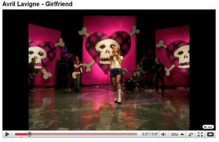
In Avril Lavigne’s ‘Girlfriend’ video there are three main characters:

The Girlfriend – a moderately dressed, ginger girl with glasses. The audience automatically labels the girl as being a boring nerd, who is fridgid and is a good girl, not liking trouble or upset.
The boyfriend – is has an appearance like Avril. He is wearing skinny black jeans, a black top, with black hair. Our stereotyping therefore categorises him as a skater/grunge stereotype.
Avril’s character - a black haired girl who wears eye liner. She is wearing black skinny jeans and a black top. Our stereotype of this girl is the grungy/skater type, who is mischievous and goes looking for trouble, starting fights with other people for no reason.

From the appearance of these characters and their presentation, we can tell that the boy and Avril seem to be better suited to each other and should be together, showing how representation through costume achieves different looks as we automatically stereotype different characters within a narrative.
In our video we represented a stereotype of a cheater. Our brainstorming lead us to someone who was attractive enough to attract a variety of guys and who looked fairly materialistic. We thought this girl would have dyed hair, fake nails and a tan. To allow the audience to decode and quickly recognise the ‘type’ of person being portrayed and stereotyped within our video. Our initial idea was to use Danni, as she is very pretty and has dyed hair, creating an illustration of a materialistic girl. Unfortunately, Danni pulled out of being in the video, so instead we used her sister. Luckily she was as pretty as Dannie and could pass for a materialistic girl. This change made it seem more realistic as indie lovers are less likely to have blonde hair, thus meaning our character appeals and talks more to our target audience better than our original casting girl, Danni.
Extreme artificial lighting is most common within music video’s, eg. Cheryl Cole’s ‘Fight for this Love’ extreme lighting is used to emphasis her as a newly single singer as well as her flawless completion.
At 1.20 seconds in Avril Lavinge’s video for ‘Girlfriend,’ extreme lighting is used to highlight her in the centre of the gang dancing.
 This shot is powerful in portraying the message that she is all the boy is thinking about and he can’t get her off his mind. It is a strong shot for her, putting her in a position of power as the other women. This was not necessary within our film as the only person we wanted in a position of power was the original boyfriend. We didn’t want the girl to be the only thing on his mind as it is a video about him getting over her and would have shown him in a vulnerable position not being able to forget the girl.
2.) How effective is the combination of your product and ancillary texts?
When designing our poster and DVD cover we wanted a linking theme to run between the two and the video, so that our target audience, of 15-20 year old indie/rock/music in general lovers, would be able to quickly and easily see a coherent relationship between the three media. We wanted to do this so that there was a synergy in the marketing campaign for the song. After this decision had been made, we decided to look through our video to find any qualities which stood out and could be easily converted onto paper (the poster and DVD cover). We decided the most marketable quality which we could use to sell our products best would be to use the band as the direct sellable faces of the product. The youth of the band would appeal to our target audience as they could relate to the faces they see in front of them, helping to sell more records. The indie/rock genre stereotyped dress code is a vintage t-shirt, ripped straightleg jeans and hair: for boys -long, between ears and chin and girls - past shoulders with a side-swept fringe or some sort of faux-hawk long hair combination. The general look is vintage and old school which connotes a message of laid back, easy going and not putting too much energy into anything.
For the poster we decided to take the image of each individual band member on the swing, cut them out in Photoshop, and then position them on a background...
To cut each member out we had to do one band member at a time. We opened their picture up in Photoshop and saved them under their name. Then we clicked on the layer of where the actual figure was and mask them. Then, we clicked on the background and choose the erase tool. We chose the icon to be round so there was no harsh, sharp corners on the figure once they have been cut out, which would stand out to a high degree, once there is a background behind the figure. With the erase tool, we carefully went around the figure, deleting the background. (The background consists of small grey and white checks, so you know when you are deleting the background) Once we had done one figure, we moved onto the next one.
After we did all four we opened up a new Photoshop page and titled it ‘Tramp Etiquette Album Cover’. Onto this we opened all the band members, re-adjusting their size to ensure they were roughly even and there was no one who stood out excessively and began testing out different background. In order to keep it simplistic we opted for a block colour background rather then mosaic, as the pattern would have made the image too crowded and claustrophobic.
We wanted to maintain Tramp Etiquettes signature colour, so we put a deep purple background onto the poster. This looked good as the colour is simple and stands out. Also because only the most expensive dies can be used to make purple it signifying royalty meaning it looks expensive and has a materialistic attraction toward it. We also thought to use the colour as it links the personality of the band to the promotional materials. We didn’t want to manufacture the band completely, e.g. The Monkeys, Girls Aloud and Spice Girls, as we wanted their own personality and attitudes to come across within the material being sold, e.g. the video, the poster and the album cover as ultimately it will be the band who sell the music rather than the picture on the poster. The fun, energetic colour would also appeal to the target audience as the music is upbeat and energetic, like the young people who would join together and listen to the music in convert.
We used white writing as it was a block colour and stood out well on the purple. We chose it to be purple as it linked to their original CD cover, with the 'Ribbon' font, creating a swirly and gentry image which links to the opening credits colour, producing constancy between our main media text and the promotional materials which will help raise audience awareness. This linking theme is a subtle connection which should help jog the viewer’s memory to the video, and DVD hopefully resulting in more sales.
We also found that a black background was also a very effective colour to use on the poster. Because we couldn’t decide between the two of them, we decided to keep both, meaning people may spend more money by wanting to ‘collect the set’ and have one of each. As we used the same image as the purple poster, we wanted them to be the same but with just different colours. Therefore we used gold writing as it was a block colour and stood out well on the black. It is also one of Tramp Etiquettes signature colour, which links nicely to creating brand consistency.
To maintain consistency among our products we decided that we must create a black and purple DVD cover in the same theme as the poster. This would ensure that in store, customers wouldn’t be searching for our CD if they had seen the poster, as it would stand out straight away due to the similarities.
We used Indesign to produce our album cover, as this contained a number of templates, which allowed us to focus on the design rather than the technical issues. We imported one of the still images of the band from the dektop onto the programe abd positioned it into the correct place. The second was done with a green cackground (so we were able to put our own in.) With the Lasso tool we went around the band and deleted the background. We then saved it and imported onto the InDesign page we had up. We positioned this picture of the band on the front of our DVD cover as a clear selling point to the DVD as the audience could quickly see exactly who the band are. To change the size we had to alter them on a % rather than just making them bigger and smaller on the screen.
We then used the imformation on the bands myspace about 'who they are/what is Tramp Etiquette' as a blur on the back of the cover. We could not use a list of songs on the DVD as there is only one and a list of items on the DVD would be boring therefore we felt the myspace words were an approriate blur to use as it sumed up the band nicely.
To copy the 'Tramp Etiquette' words from the bands myspace background we used the 'print screen' button on the keyboard and pasted it onto photoshop where we cropped out one of the many 'Tranp Etiquette's' and saved it. We imported onto the screen back in InDesign and postioned it on the front of our DVD cover.
Overall all three of our media texts were quite effective in containing linking themes in order to aid the viewer to relate each of the different products to one another. We used a few main attributes as connecting themes:
- The purple colour
- The swirly writing - font 'Ribbon'
- The band
Overall the consistancy is clearly visable and a valuable theme needed in order to sell the products more effectively.
3.) What have you learnt from you audience feedback?
To first establish our target audience, and exactly what they would want within their music video I created a questionnaire which was filled in by our class mates, and then I replicated it on Google Docs, which we then sent to our friends on facebook. Inevitably this is a selected group of people anyway, with few people over the age of 25. This means our target audience was already narrowed down to the audience we felt would be interested in the band. On return of our research we found out some main concerns we needed to incorporate within our video:
- there were a few categories which stood out most, but the majority of people’s favourite music was indie/rock which is lucky as this is the main genre of the band.
-the audience wanted to have a storyline running parallel to the lyrics of the song
-the storyline is important to the lyrics
-the band should be kept to the chorus.
The response was from the majority of girls, showing they are more pro-active. This means that we know the desires of the girls more than the male population, and must take this into consideration when producing our video. We do not want it to be biased or appeal to girls more then boys. Therefore we must look at the male feedback more carefully and take this into account more, as it is a smaller group.
With these focus’ in mind we went away and developed a plan which our target audience would hopefully enjoy.
On completion of our music video we didn’t feel it was up to scratch, so Danni burned it onto a CD and look it home to show her family. From there comments we learnt:
1.) It doesn’t look professional enough”
2.) “it take you a while to realise that she is cheating on him, it’s not predominantly evident”
3.) “its missing something”
4.) ‘‘the middle bit, where they are giving her gifts is a bit boring”
These were very valuable comments to our final production as it meant we got a view of what an unbiased, outside audience felt about our video, and what was really wrong with it.
The next day Danni re-filmed the opening scene and in the evening edited it to fit the beginning. This meant it was easier and quicker to tell that the girl was cheating on him. In the lessons Danni took us by surprise and showed us her re-filmed and edited work. We both agreed that it was a much better piece of work than what was previously done and she had done well. Throughout the next lessons she added filters, adjusted the gamma, RGB balance mix. This contributed to the overall appearance of the video, making it seem more professional.
Danni and I than selected the dissolves and cube spin to the transitions between scenes helping to create a more professional feel to the video and make it more interesting to the viewer.
After we had made these changes, we again showed it to a number if viewers. This time the comments were more positive:
1.) “it looks more professional”
2.) “I like how the middle part spins, it makes it look like it’s doing four rotations of a cube”
3.) “I like the band being darker, it seems more impressive”
These comments were good signs, but there were also a few negative comments:
4.) “it’s still not very evident that she is cheating before the first chorus”
5.) “so is she cheating on him”
So overall the re-editing was a success and added positive elements to our video.
4.) How did you use media technologies in the research, planning, construction and evaluation stages?
Media technology was a major advantage and contributor through out the creating of our coursework.
In the research and planning stages we used Apple's Pages word processor to create lists of ‘things to do’ and deleted them as we went along. We also used it to write a synopsis of the video and to create a camera angle plan. This gave us a detailed breakdown of the camera angles we would be using alongside the lyrics of the song. Pages enabled us to quickly and easily edit information and meant we didn’t have to re-write material. It also meant we could have three copies for each member of the group without having the effort of re-writing it.
Through our research stages we used Youtube to find and analysis different music videos. It enabled us to find the conventions of different media productions, and gave us ideas to use in our videos.
Google Docs was a quick and effective way of distributing our questionnaire to a large quantity of people, and receiving a quick, easy reply already formatted for us. It meant we weren’t transporting large quantities of data from sheets of paper, which people had filled in, to hand drawn graphs. It allowed us to quickly see what our audience wanted to see within a video with little hastle.
Once we had drawn our storyboards, we scanned them onto the computer into a pdf file and uploaded them onto issuu.com. This then gave us as online, digital book which we were able to embed into our blogs.
We used digital camera’s take pictures of the couple, which we used in the opening of our film, the poster and DVD cover.
When editing our film we imported the song from a CD onto iTunes. Then we transferred the song onto Final Cut Pro. We put the song on before any of our filming so it enabled us to edit the filming around the song rather than having made the film and being left with the panic of the film not fitting in with the timings of the music. Once we had this in place we began to upload our footage form our DV camcorder onto final cut express. As we went through, we divided each filming scenes into sections using input and output points. This meant we had the sections divided up as we went along rather than at the end of uploading the footage having to go back through and cut it up into sections. It meant it was much more manageable, quicker and easier to find what we were looking for.
Once we created our film we used Cubase to record our directors commentary. With the original song we turned the volume down low, so it could just be heard. I uploaded our commentary over the top and changed the volume to make it more even as Bobbi’s voice was louder than mine. When we were not talking I was able to raise the volume of the song ‘Cheater’ so the video was not boring when no one was talking, and the lower the volume when we started talking again.
The blog was useful in recording our progress throughout our production. Being in digital for meant we could go back and re-edit what we had done.
Email and Facebook were used throughout to keep in contact with the group and Mr Van Straten.
We used Photoshop to create the poster for the ancillary task. This programme was specifically useful for the poster as it meant we didn’t have to take a perfect picture of the band as we wanted them to be. We could slightly edit the position of the band member/colour/lighting within the picture, and were able to cut out specific figure and paste them onto a different background.
Indesign was useful with the DVD cover as it meant we could have picture and text on our DVD cover, making it look professional and not hand drawn. This means that our products would be sold more easily as they are of better quality.
On our CD of our final work we used iDVD to create a menu. We were able to choose a theme to which fitted to the attitudes of the band and was in-keeping with their friendly, happy attitude. The use of technology allowed us to create a more advanced product than what we would otherwise be able to create.
No comments:
Post a Comment