A2 Media Studies Advanced Portfolio planning, research and evaluation
During our first Media Studies lesson we had to organize ourselves into groups of 2-4. Once we had done this Mr Van Straten gave us the catalogue of topics which we would be producing our media studies project on. The selections were: documentaries, a mini film, trailer, radio advert or music video.
We began brainstorming ideas of what we could do for each of the topics we were given and what we could visualise as having the best outcome and final effect. We all wanted a challenge of something new and a project where we could learn the most new skills. After much deliberation of each theme we chose the music video, with the ancillary tasks of a magazine spread and DVD cover, as it was certainly something new: providing us with a great challenge; giving us a chance to learn a lot of new skills and would require us to use our imagination to produce a dazzling video.
Once we decided on the music video, we had the task of finding an unsigned band who were willing for us to use their song in our video. Therefore we resorted to myspace, the unsigned music hot stop. After some searching we found a few bands we liked, so emailed them via myspace asking for permission to use their videos.
After we had done this, Dannie showed us a band called 'Tramp Etiquette.' (http://www.myspace.com/tramp_etiquette) Where she knew the bass guitarist, Tom, from playing poker. After listening to a selection of the songs on their page and liking the sound of their music, Dannie text Tom asking if they were interested in us making them a video. We arranged to meet them on 8th October, meaning we didn't have long to get our plans on paper to present to the band and get their feedback.
Ideas and Brainstorming...
We have now begun to get our ideas on paper. To help us, the band sent us the song in an email and the lyrics so we could listen to the song properly and get the full flavour of what it was about. To ensure we encapsulated everything, the audience desired within a music video, we decided we would need to carry out some audience research. Initially we carried out our questionnaire on our media studies class:
https://blogger.googleusercontent.com/img/b/R29vZ2xl/AVvXsEj0u44TXpoFovF7eIbUgRGED29CSstFFB7I9G-z3mgXQPTwH1Drze0X3Ue3vnkANcOw61esb68gNAksn9CiXWWPSZJqEGP2UdhO9mlo0WnRLeXn8IAgvBS4KW2RN2CKqgSzG9YGc5rBEn8/s1600-h/quetionair.bmp
But requiring a larger audience to establish a greater feel for our target audience, I put together a questionnaire on Google Docs and sent a post on facebook, so a variety of people were able to take part in our research.
http://spreadsheets.google.com/formResponse?formkey=dHgtNG1MOXVwUG1CT2NCVWZQbjZHcVE6MA&theme=0AX42CRMsmRFbUy1jZGZhYTJjOC0xYzc1LTQyYzEtYWM3MC1mMjQ1YzEwYWM3NzE&ifq
From our audience research we were able to created graphs and analysed the information!
Question 1 - What is your gender?

The band describes them selves as, “Everything you love, but slightly better!!!! It's not for us to tell you who we sound like - that's entirely a matter for you, so feel free to paint your own influences and references on the Tramp Etiquette Sound. Alright, we're a blend of Girls Aloud and Dumpy's Rusty Nuts. But no doubt that'll change next week.” Therefore they reach a large audience, encapsulating all genres. This means we are making a music video for everyone. From this graph we can tell the majority of people taking part in our questionnaire like indie music, which is lucky as this is the main genre of the group, resulting in us making our video to suit Indie music as the majority, while taking into account the tastes of other genres as we want the widest possible audience for our video and the band.
Question 2 - How old are you?

This question told us that most people listen to music everyday. Consequently we will need to choose a catchy song, which won’t become too repetitive to the target audience, and one they will enjoy for a long while. It must be up beat and fresh to ensure the audience shall enjoy the music video and other media products to their full potential.
Question 3 - What is your favorite music genre?

Question 3 shows us that our target audience's top three favorite genres are 1.) Indie 2.) Rock 3.)R&B/Hip-Hop. This means that we must find a band which is either one of these genres, or a mixture between them to fulfill our target audiences desires.
Question 4 - How often do you listen to music?

Graph 4 shows us that people like to listen to music everyday. Therefore we must choose a song which is catchy and a video they won’t get board of.
Question 5 - How important are the lyrics in relation to the music video?

Graph 5 shows that the lyrics are ‘very/quite’ important to the target audience within the music video. Therefore, from this we have learnt that having the lyrics of the song relating to the video and storyline on screen is very important to the target audience to ensure they are fully pleased with the final product.
Question 6 - When watching a music video, what appeals to you?

This graph is very important to the creation of the video as it tell us what our viewers want to see within the video. It shows us that there is an even balance between the storyline and the band. Therefore we will need to divide the song up so both the band and our storyline get equal showing in order for our video to best appeal to our target audience.
Question 7 - Do you like a storyline in a music video?

Graph 7 shows us the storyline is very important to the target audience. Therefore we must ensure that the video encapulates the audience and keeps their attention throughout the video, so they watch it repetitively.
Question 8 - How often do you want to see the band in the video?

The information established from this question informs us that we must have the band within the video at some point, as no on likes to not see them. The majority of people want to keep the band to the chorus. As a result this will free up time in the verses, allowing us to run a storyline then, with the band being limited to the chorus, fitting the desires of our target audience.
From our research and our own views, we wanted to have a storyline running perfectly parallel to the lyrics of the song ensuring it would easily make sense and be effortlessly comprehendible to the viewer. This would ensure that the listeners would be able to relate to what they are seeing and hearing in a corresponding storyline, rather than a random one, giving a more pleasing experience for our audience. This meant we had to create a story revolving around the lyrics, which wasn’t hard as the song is about a girl cheating on the boy, and the boy gaining power and getting over her through this song. We therefore wanted to replicate this power and control he was overcoming his feelings within our video.
Through brainstorming we came up with a few ideas which we could incorporate within our video:
I came up with the ending to the film, as I felt it was a nice ending to the storyline. Throwing down the pictures and watching them burn was a symbolic way of ending the relationship and for the boy to finally get over the girl.
The beginning with the photo’s being thrown down came from a previous A2 video we had watched were a druggie walks past himself in the future. After coming up with the end, I suddenly got the idea that the boy can be flicking through the pictures at the beginning, meaning the video becomes him going through the relationship and remembering all that had happened.
I came up with the idea of the boys sitting on the sofa and change places from the Next advert where the ladies clothes changes. We checked with Mr Van Straten and he created a mock up of our idea to ensure we were on the right page so he could help up. Our idea being the same he said it was possible but would require a lot of work.
1.)
2.)
3.)
Doing some further research we also found out the opening credits to 'Scrubs,' the TV sitcom also had characters changing places, in this case it was the Doctors, changing places with one another while walking along with an X-ray.

The point where all the pictures of the different boys flick up at once came from Bobbi. She has an Andy Warhol picture of Marilyn Monroe on her bedroom wall, and she got the idea from this.
From these ideas we wrote a synopsis of our video. It is a basic outline of this what our video will look like.

After working out our synopsis, it meant we could analyse, in greater detail, how the music video would work and pan out (which shots for which lyrics, and camera angles). To help us do this we broke down the words in the songs with the timing in which they were sung, enabling us to assess how long each camera hold could be and how everything would fit in with these timings. This facilitated in creating a clear picture in our heads about how the video would pan out, and helped our ideas merge together to become aligned, lending a hand to make our video the best it could be.

Research into music videos...
Once Dannie got in full contact with the band through texting, we were able to establish that they were incredibly enthusiastic for us to make a video for their song. Subsequently, we were able to arrange a meeting with them so we could run over our idea and the plans we had for the video. This will be on Thursday 8th October.
With the date set up, it meant we didn’t have long to create a detailed plan of proposals for their video. We wanted to ensure it would encapsulate the atmosphere and mind set of the band, meaning we would need to do some research into them... From their myspace we discovered they were quite a fun, cheeky band who liked to have a laugh. This can be seen by the way they describe themselves...
1.)
“Everything you love, but slightly better!!!! ... feel free to paint your own influences and references on the Tramp Etiquette Sound... But no doubt that'll change next week.”
2.)
From the Collins English Dictionary and Thesaurus:
‘To Tramp:
1: To walk heavily or firmly
2: A heavy or rhythmic tread
Etiquette:
1: ‘A conventional code or practice followed in certain professions or groups.’
This shows them amusing in an educated way. It is sophisticated humour, showing they are smart, but like to be entertaining with it.
3.)
They them have another ‘definition’ of their band...
‘Mummy, what's aTramp Etiquette?
Well, dear, it's the act of four, disturbingly fertile young men, leaving heavy and rhythmic tracks across the conventional highways of mediocre rock dross. Now go to your room and listen to the Feeling instead.
But Mummy, I'm bored of the Feeling. Daddy says they're too safe. He says Oasis have lost their edge, the Pigeon Detectives are crap and that modern British Rock and Roll is too safe. Is Daddy right?
Yes, dear, Daddy's right, thank the Lord. Rock and, indeed, Roll has finally become a safe place for children to play; a nice, neat and tidy adventure playground. Take my advice, daughter, and stay away from those shady trees where the likes of those Tramps reside and stick with the squeaky clean swings and roundabouts of the Feeling.’
This illustrates the band's humour. They are giving their interpretations of the music genre and describing themselves in a comical manner.
4.)
‘...a good band to invest in. You need to back a winner now and again.’ This gives you the idea the band is cheeky and fairly confident about their ability.
With this representation about the band, we knew we needed to make the video amusing, energetic, mischievous and exhilarating to capture its essence. Bearing this in mind we began to do some research into comparable bands.
This lesson we researched other Cheater song videos, with a common top ten being repeatedly seen.
1.) I heard it through the grape vine – Marvin Gaye
2.) Jolene – Dolly Parton
3.) Me and Mrs. Jones – Billy Paul
4.) Lips of an angel – Hinder
5.) It wasn’t me – Shaggy
6.) Secret lover – Atlantic Starr
7.) Cry me a river – Aerosmith/Justin Timberlake
8.) Careless Whisper – George Michael
9.) Before he cheats – Carrie Underwood
10.) Jealous guy – John Lennon
These videos helped to give us a feel for videos about a boy/girl who cheats on the partner or who is found cheating. A recurring theme within these songs is someone who has been hurt and is grieving, but who is getting over the problem/becoming stronger within the song. We wanted to portray this message within our video to follow the conventions of these love songs. We therefore needed to subtly hint this message throughout our video, scattering it in different scenes, so the audience pick up this sense of the boy getting over the girl and overcoming this hurdle without wholly realising it and it being obvious to the audience. To do this we will faintly need to do it in a multiple of scenes.
The first will be when the boy walks in on the girl with the other guy. He will not get angry or cry on screen, encoding constraint and an emphasis on his strong personality into the video.
Following this, the audience must not see the boy crying throughout the whole video, meaning there will be no decoding of weakness or fragility of the boy.
The final glimpse the audience will see of our boy being mentally powerful and letting go of the girl will be at the end, when he is throwing the pictures of them on the ground proceeded by him setting them alight and walking away before they are entirely burnt. This encodes that the boy is over the relationship before it has ended completely, giving a positive message to the audience. It is a powerful scene to end on because the pictures being thrown down and burning represent the path of the relationship and the abrupt painful end which it has come to, with the words ‘STOP’ being the finale, as if the relationship has ended with him saying this word to the girl, resulting in a powerful closing image for the audience to think about. We felt this was particularly ideal for our video as the words of the song are strong, about revenge, overcoming the girl’s behaviour and relationship and finally moving on with his life without her.
We researched a number of Indie/rock music videos but the ones we got most of our conventions and examples from were:
1.) Arctic Monkeys - Fake Tales of San Francisco
2.) Kings of Leon - use somebody
embeding disabled: http://www.youtube.com/watch?v=LWhairF_DS8
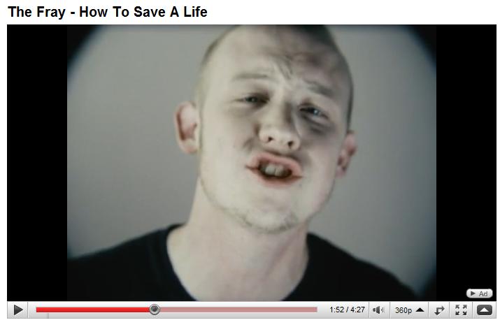
3.) The Fray - How to Save a Life
embeding disabled: http://www.youtube.com/watch?v=nY2INQnmRyk
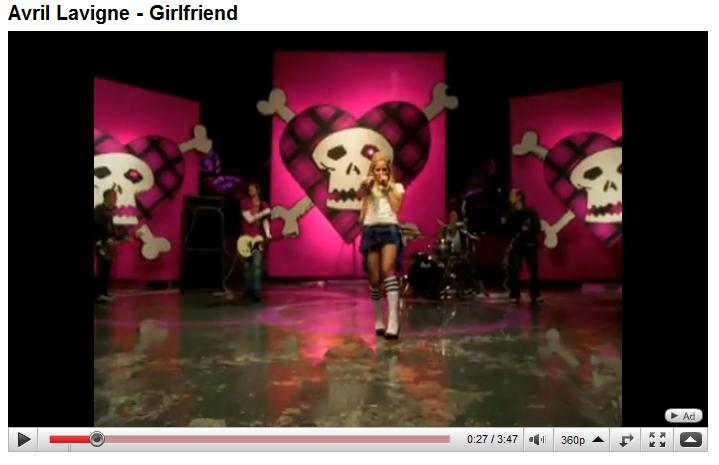
4.) Avril Lavigne - Girlfriend
embeding disabled: http://www.youtube.com/watch?v=qIcDYJbpg6Q
From our music video research we discovered there are a few conventions which our media audience would expect to see:
1.) Shot at life performances/on stage

.jpg)
This is a common trait seen in an indie/rock video, which audiences will expect to see at some point within the video. It helps to give the audience a real feel for the bands energy and help them feel apart of the action, as well as helping to re-create and mirror the atmosphere the audience at the gig would be feeling, for the people watching the music video. Our research has shown us that nearly all the bands have themselves performing onstage in their video and our market research has shown us that the target audience desired to see the band playing in the chorus of the song. Because of the desire of the audience, and the convention of the genre, we will have the band playing through the entirety of the chorus.
2.) The artist/band is shown throughout the video / Structure is performance based
This convention within the indie/rock genre could make our media product fairly boring. Our market research also told us that the target audience only wanted the band to be in the chorus and not through out the entirety of the video. Therefore, to test our editing skills, and create a more interesting video, we will minimise the band to the chorus.
3.) A dark location / black and white – which emphasis a particular mood within the video
With the use of colour, we can alter the filters of most of the clips in the editing stages so they will became darker and more saturated which will create a dejected, disheartened feel to the video, reflecting the mood of the song.
4.) Use of camera angles vary throughout - extreme close ups and long shots are popular
Our research has shown us that Indie/Rock bands have a mixture of different camera angles of the band within the chorus. These included:
a.) Single shots
This is a common convention used within real media product.
The guitarists…


We feel having individual shots of each band member will give each one a little more lime light and ensures the entire band are seen on the video. It will also add more variety of different angled shots into our video means it will become more interesting and help to maintain the audience’s attention. The extreme close up shot of the guitar adds detail to the mis en scene shot/video as well as helping the audience focus on the action being performed. The shot magnifies the object showing how important the guitar is to the performance which helps link the music they are hearing with the video they are seeing
b.) Group shots – high and low angle


When the band is playing onstage in indie/rock music videos there are always group shots of the band, from a variety of different angles. This is a common convention used in real media products which we believe will be a good idea to incorporate in our video as it will show the audience the band united and as a whole. Long shot a also emphasises the background which sets the scene and establishes the shot. It helps the audience to locate the band at a gig and stops them becoming confused when watching the video from the constant band/storyline switching.
c.) Close ups
A common camera angle used in indie/rock music video is a close up of the singer. This is to show the emotion of the singer reacting to the lyrics and influence the audience’s response to the words. It also helps reflect the words of the song and movement of the artist’s lips, creating a further connection with the audience.
We also learnt that special effects is a common convention used in music video’s:
At 0.59 seconds of The Fray, the image turns into a blur and pulsates. This is used as it helps to recreate the feeling of the audience crying, having lost someone and not being able to see properly. This fits with the lyrics of the song about loosing someone, i.e. mum, dad, granddad etc which makes it an effective dissolve for the song as it lends itself to putting the audience in a feeling of vulnerability and fear which is felt when crying.
At 0.30 seconds of Kings of Leon there is a slow dissolve of the city into a close up of the lead singer. At this point the musical interlude is slow, which means the dissolve is appropriate to that the audience are hearing. The close up shows the emotion of pain and frustration on the singers face.
At 1.59 of the Arctic Monkeys, the editing is fast forwarded, slowed down to read the signpost, then fast forwarded again. The music at the time is fast paced and quick. This clip being sped up helps emphasis time passing and creates the illusion of the viewer being in a car.
At 1.05 seconds of Gorilla’s, ‘Feel Good’ there is one figure on view, and another dissolves is next to him. This gives the feeling of a hectic scene, with a lot happening at once.
To just from one clip to another we have decided to use some special effects throughout our media product.
-To jump from the chorus to the storyline in the verses, and visa versa, we have used additive dissolves to help the images onscreen flow with more ease. The disolves emphasis time passing and helped the audience get a sense of how long the affair had been going on. We used quick dissolve to stay with the pace of the music and ensure it kept the atmosphere energetic and lively. The Fray, ‘How To Save a Life,’ use slow dissolves, which makes the picture blur before revealing the next shot. This is effective for the song as it is slow paced and fits with the feel of the song and rest of the video, whereas our music video is fast and energetic, needing quicker dissolves to keep up with the pace of the song as well as the storyline which goes alongside it.
Another thing we have discovered is how the identifiably of stereotypes is vital in the portrayal of music video narrative. The viewer only has a small window of opportunity to look at the character and identify what they represent. They need to only look at the character and immediately know exactly what type of person the producer is trying to portray through the connotations of certain aspects of their dress, appearance and behaviour.
In Avril Lavigne’s ‘Girlfriend’ video there are three main characters:
The Girlfriend – a moderately dressed, ginger girl with glasses. The audience automatically labels the girl as being a boring nerd, who is fridgid and is a good girl, not liking trouble or upset.
Avril’s character - a black haired girl who wears eye liner. She is wearing black skinny jeans and a black top. Our stereotype of this girl is the grungy/skater type, who is mischievous and goes looking for trouble, starting fights with other people for no reason.
The boyfriend – is has an appearance like Avril. He is wearing skinny black jeans, a black top, with black hair. Our stereotyping therefore categorises him as a skater/grunge stereotype.
From the appearance of these characters and their presentation, we can tell that the boy and Avril seem to be better suited to each other and should be together, showing how representation through costume achieves different looks as we automatically stereotype different characters within a narrative.
In our video we were looking a stereotype of a cheater. Our brainstorming lead us to someone who was attractive enough to magnet a variety of guys and who looked fairly materialistic. We thought this girl would have dyed hair, fake nails and a tan, to allow the audience to quickly recognise the ‘type’ of person being portrayed within our video. For ease, our initial idea was to use Danni, as she is very pretty, has blonde hair and fake nails, creating an illustration of a materialistic girl. Unfortunately, Danni pulled out of being in the video, so instead we used her sister. Luckily she was as pretty as Dannie and could pass for a materialistic girl. This change made it seem more realistic as indie lovers are less likely to have blonde hair, thus meaning our character appeals and talks more to our target audience better than our original casting girl, Danni.
Extreme artificial lighting is most common within music videos, e.g. Cheryl Cole’s ‘Fight for this Love’ extreme lighting is used to emphasis her as a newly single singer as well as her flawless completion.
At 1.25 seconds of Avril Lavinge’s ‘Girlfriend,’ extreme lighting is used to highlight her in the centre of the gang dancing. This shot is powerful in portraying the message that she is all the boy is thinking about and he can’t get her off his mind. It is a strong shot for her, putting her in a position of power as the other women. This was not necessary within our film as the only person we wanted in a position of power was the original boyfriend. We didn’t want the girl to be the only thing on his mind as it is a video about him getting over her and would have shown him in a vulnerable position not being able to forget the girl.
CASTING
After listening to the song a few times and to create some detailed planning of how we want our video to pan out we started to think about who we want in our music video. We obviously want to conform to certain ideas, conceptions and connotations of a cheating girl to the audience. Therefore we wanted someone who was obviously pretty enough to acquire a variety of guys and who looked fairly materialistic. She had to convey the stereotype of a cheater to the audience immediately, so they could decode and quickly recognise the ‘type’ of person being portrayed within the video as there is a short window in which the audience has to recognise this character. For convenience, we wanted a close friend/someone in our media class/our group. Therefore we chose to use Danni as she is very pretty and has blonde hair and fake nails, creating an illustration of a materialistic girl who liked presents and attention.
Next we needed two guys who looked different enough for people to tell them apart in the small scenes they would be featured in. For ease we chose Jerome and James, two of our friends in the same lesson. This would allow filming to be easier as we all had the same lesson to do filming in. Also, being in our lessons meant we were constantly exchanging ideas to enhance our film and deduce the best ideas possible, so the boys knew our filming plans and ideas fairly well.

.jpg)
Meeting with the Band
Dannie and I had the meeting with the Band and their Manager. We brought our folder with our plans for the video, and gave them a quick brief on how we were forecasting it would pan out. This meant they could read through our proposals and give us some feedback and their own input, as it’s their song and we want to fulfil their desires and thoughts of how the video would go. We thought this was important as it is there song and the video would be put on you tube in their name, adding to their reputation. They seemed to really keen on our ideas and like the themes of our video:
-the band featuring in the chorus with a storyline running to fit the verses
-the pictures being shown at the beginning and the end of the shot the emphasis’ time.
After some discussion on casting, they said they knew a model called Amon, who would be happy to be in our video. This is necessary as James had a hair cut, making him closely resemble Jerome, and thus deeming himself unsuitable to be cast in our video. The band got in contact with Amon straight away with great success. We exchanged email addresses with him so we could contact him about filming times etc.
With the band, we set up a date for filming. They were unable to do many days due to gigs and recording sessions they had, so the date set is Sunday 11th October.
After meeting with the band, and receiving there input about the film, the manager sent us written conformation for us to use their song for our video the very next day!

This means we now have the go ahead to plan the finer detail and exact plans for the video and begin filming!!!
Storyboarding!!!
We can now proceed with drawing the storyline, consisting of what camera angles and shots we will be using in our video to encode different message within the video. We can also complete the exact timings of the video knowing that we don’t have to change anything. This means we can start creating more detailed planning of the video and begin to look at the logistics of filming.
Details of filming!!!
Today we created a camera angle breakdown. This is a more detailed version of the storyboards as the camera angles run alongside the lyrics of the song, so we know how much of each footage/angle we need to shoot. It will ensure that we know exactly what camera angles we will be filming and need to capture and for how long for.
.The breakdown will also mean on the day of filming, we will be much quicker as we have the exact angles drawn out in front of us and we won’t need to keep thinking about what we want the video to look like. It will ensure that we capture all the camera angles we need, which is particularly important as the Sunday is the only day the band can film, and we only have a limited time with them.


In conversation video
This video is a clip of us giving a summary about the logistics of our. It explains some of our ideas for the music video and ancillary tasks.
Filming the band!!
Today was a success! After house music, Danni and I drove down to the boy’s school and collected three cameras from Mr Wellington, who then helped us clear the stage of chair, tables and other surplus equipment which had been left. We set up the lighting which would help enhance our set.
We used four free standing spot lights, which meant we could direct them on each band member to enhance and lighten their appearance in the lens of the camera, taking away any shadow which may fall on their faces and cause the footage to be useless/lower quality than we desire, making it look less professional.
We also used two sets of four coloured lights which were already set up for use. We wanted to use these as we felt it help portray the bands fun side through the use of colour and help their band personality stand out. We fitted them with a devise which made them flash in time to the music, which we thought would help enhance the set and ensure they wouldn’t flash out of time, making them look peculiar and unprofessional. Once we had this set up, we went for lunch.
At three o’clock we were back at school ready to meet the band and begin filming. We helped them carry their equipment into the hall while they began setting up. We set up the three cameras to ensure we could get the most shots in the shortest amount of time as the band had to leave at 5:30. We had one camera at the left hand side of the stage, one for the middle and one for the right. Once we had set them up we positioned the band in places where they could be seen by all three cameras, and where it had the best effect from all the different angles.
We had the band repeat the song over and over so we could film at different distances away from the band and at different heights. We believed this would give us more footage to work with to ensure the audience didn’t get board of seeing the same angle all the time, and to make sure we had more than enough in cause we were unable to use certain footage for some unknown reason.
We then moved all three of the cameras so they were all on one band member at a time and filmed them playing the song all the way through. This too gave us a variety of angles to work with to keep the interest of the audience, and allowed us to select the best angle once we were in the editing room and we could see the whole angle played through.
We had the band miming to the song while we played it on a CD player. This meant we didn’t have to rely on the sound of the band as the acoustics in the hall are not set up for a gig with loud speakers and drums. It would also allow us to lay the song on the timeline in final cut pro and to edit the filming around the song, rather than lining the filming up, and having to edit it in chronological order, making our later job a lot easier.
We managed to get all our filming of the band done in this afternoon with hopefully a great success.
Uploading the footage!
This week had been was dedicated to uploading the footage on our camera to the computers. We have been using input and output points to create little titled sections of the footage rather than having one long piece of footage we have to search through and chop up.
We have moved the song from the CD, onto i-tunes, and then imported it into final cut express. We placed it on the timeline and are beginning to fit the footage of the band to the Corus. We are doing it this way around as it will mean our timing for the band miming the words to the chorus will defiantly fit together, making it easier than having fitted the story to the verses then trying to fit the chorus in.
Dannie has seceded as our actress, so we have changed our girl actor to Grace. In retrospect this is a wiser choice as she does A level drama meaning she will be able to give a better feel to the video through her looks and acting skills!
The storyboards
Re-thinking about our film, we have decided it is more logistical to film the boy finding out about the girl cheating in the house than outside Costa for a number of reasons:
1.) The fact that we would have to gain permission from Costa to use their premises for filming, which would probably take a long time and not be hassle free.
2.) Changing locations on our only day of filming would use up valuable time which we can’t waste in order to get all the filming done in the small space of time.
3.) Organising the general public would be difficult as they would want to come in and out of the shop as they please, and would be constantly moving, making it harder for us to jump between different cuts as one minuet someone would be there and the next they would not.
Therefore we have re-thought this and decided to have the boyfriend walking in on the boy and girlfriend on the sofa making it a more intimate shot. It would also mean there is less confusion with the fact she is cheating, rather than them just being friends out for coffee. We have re-written our storyboards for our filming in the holidays…

Half term filming!!
On our day of filming we have woken up with many problems:
1.) We hadn’t got any cameras
2.) Grace AND Jerome had both pulled out that morning
This made our jobs a lot harder. We were on the phone to anyone we could get hold of to fill in for our actors. In the end we had Dannie’s sister being the cheater and Tom Baker to be the boy who is cheating. Dannie made a urgent call to Mr Wellington to ask if we could get the cameras from school as she lived in Berkhamsted making it more practical and easiest for her to do so.
After solving these mishaps well all met at Danni’s house and made our way to her Granny’s were the filming would take place.
On arrival Bobbi and I set the room up to help the misenscene of the house. We removed elderly looking furniture, and any ornaments and photos/pictures that dated the house. This helped to achieve the look of a young couple’s house. We than used the storyboards and walked through the rooms, camera angles and route which we would be filming to ensure we didn’t need to adapt anything to fit with the house, and to guarantee everything would run smoothly. While we did this, Dannie was at her house taking pictures of the couple which we would be using in at the opening and ending of our video.
We began our filming with the scenes on the sofa. We got through the whole of the boyfriends section, were the boyfriend and girlfriend are chatting, and the girl gets given the present etc, but the camera quickly ran out of battery, meaning we had to spend a long time waiting for it to charge.
We then left the sofa scene for later and moved on to Danni’s sister’s part. We filmed her in and leaving the bedroom. This look a while to get right as the room was very small, meaning we couldn’t have a panning shot of her getting out of bed and walking to the door as we intended. We tried this but the movement of her sitting down on the bed to standing up resulted in the pan being of her leaving the room with a close up of her back, which wasn’t very interesting for the audience. To link this up we filmed her walking down the stairs and finally out to Tom in the car. The first shot we took of her coming out the house and we managed to lock ourselves out the house. Consequently we had to wait for a couple of hour for another key to be cut as Dannie’s Granma was at the cinema (no phones) and there was no spare key!
To fill in time we thought it best to carry on filming more of the outside scenes: Dannie’s sister coming out the front door: walking to the car: getting in the car: greeting Tom: and then them driving away. We filmed what we could before the battery ran out again (which wasn’t very much).
By this time it was getting dark so we charged the battery up enough to complete the outside filming scenes. We went outside and completed the scenes we hadn’t captured yet without any major problems.
We then came back inside and charged the camera up again, followed by filming the leftover inside scenes: on the sofa, and the victim walking in on the cheater with another man on the sofa. Filming the walking in scene later was very successful for misenscene as by this time it was darker, as can be seen at the double patio doors, and when the camera cuts to the front door of the man walking off into the darkness, This helped to reflect time passing as well as being more realistic as is the man could be coming in at the end of the day after work, which planned out very well for an overall effect.
On completion of capturing the indoors scenes we charged the camera for a final time and headed down the road to complete our last shot of the video: the boyfriend flicking through the photo’s, remembering all the memories of him and the girlfriend before burning them and walking away...queue camera battery dying (not even joking!!!) When we got there we realised the streetlamp next to the bench wasn’t bright enough to illuminate the man’s face and show clearly the actions he was doing. So I came up with the idea to park the car in front of the boy and put the headlights on him. These give him a beautiful illumination and proved to be effective lighting which light him up clearly and provided the audience with a better feel for what he is doing. The extra lighting also added to the atmosphere of him being light up in the darkness which could signify his loneliness in the word or his bright, strong personality in a world of darkness. The strong lighting also gave the man a sense of power and as if this act is him getting over the girl forever.
After this was filmed, we had captured all the footage we needed, and we can now begin to edit the footage.
Editing
Last week we uploaded the footage of the band and the storyline onto the Macs, using input and output points to break up the recording into smaller sections. We are editing around the chorus (with the band) first and the storyline second. This will ensure the chorus is in place and finished before we start the story, ensuring the story does not flow into the chorus meaning we would have to edit it slightly to make it fit.
Editing of the storyline is easier as we have a specific space in which we must fit it (around the chorus) although this means that slight cuts are needed to shorten different clips so they don’t overrun into the chorus.
Through perfecting our, adding dissolves etc we have come across a few problems. This includes our initial idea of having the two men sitting on the sofa changing places like the Next advert but being technologically stumped we were unable to fulfil this desire as we can not align the boys perfectly in order for them to change with ease. We have tried a variety of solutions, e.g. different types of dissolves but have settled with a cube spin instead. This is just as effective in swapping the boys and has an added bonus of creating the illusion of a great deal of time passing within the short clip being seen.
Completion!!
Our video editing is nearly finished now! We only have to:
- touch it up and create finer cuts:
- play around with the colour of some shots to create consistency within two cuts (e.g. the band):
- add dissolves etc so some of the cuts and editing isn’t so blunt:
- film the beginning scene (were the photo's are to be thrown down (which is linked to the ending!)
- add credits to our film.
These are all fine tuning things which need to be done to ensure our final product has the most professional feel which we can achieve.
Researching the ancilliary task!
On completion of the main music video task, we have now begun to start research for the ancillary tasks. To begin with we thought it wise to look at Tramp Etiquette's original CD cover to ensure we get a deeper feel for what the bands vibe is and to ensure we include their personality within our poster and DVD colour. We wanted to make sure we encapsulated the atmosphere of the band in our own work.

The Victorian image with a tramp having fingerless gloves and the ‘best china’ is a very amusing cover, playing on the name of the band, a tramp with etiquette. The way the cup is being held is a sign of gentry and manors, which creates visual grammar and denotes that all classes, even the lowest, have certain etiquette within themselves, and that they all have a set of unwritten rules with which they abide by.
The swirly writing of ‘Tramp Etiquette’ juxtaposed with the more upright font of ‘eye for and eye’ helps to create the connotations of opposites attracting, like a Tramp having Etiquette. The opposites of the name of the band and the writing font help to emphasis one another; make each one stand out more.
The image is not that of a high tech one, and was probably a digital image or done by hand. It implies they like fairly basic, simplistic images. We must therefore encapsulate this minimalism within our designs.
They clearly like the use of colour and pattern, showing the playfulness side to the band. The purple used is the bands signature colour, so we must try and incorporate that within our design as it will help create band consistency throughout every product the band produce. We must therefore try and show colour and patterns within in our DVD cover and poster.
Next we thought we should investigate all types of album covers to get a feel for our competition and what else is on the market.
Secondary market research showed us the ‘Rolling Stone Readers’ 25 Best Album Covers of 2007’. We thought this was a reliable source of information as a music magazine is our target audience for the product. Therefore this is telling us exactly what covers are target audience like and desire.

The texts on these albums are all in block colours. There is no pattern in this writing, which helps make them stand out and capture the audience’s attention with more effect.
The images are all relatively un-cluttered and basic, using one main picture or a silhouette. This therefore makes them eye catching, and gains the audiences attention.
The colour schemes are either exceptionally basic, using only two or three main colour or are entirely conflicting to this, using the entire pallet of colours in the rainbow.
Therefore, form this research we have discovered:
- We should have the font in one single colour
- We must use one, fairly plan, eye catching image
- The colour scheme should contain huge quantities of different colours or we should stick to one or two simple colours and shade.
For our final research we decided to home it in on our selected genre of music, in order to get a feel for what our target audience liked best, and to evaluate how the direct competition angled their products.


All these album covers are very basic and simplistic. They have a single image as the main theme to the album cover. This draws the viewer attention in, and is not too complicated nor containing too much information for the viewers to digest, therefore making them effective.
The writing is mainly in one colour, black, allowing it to stand out from the background, meaning viewers and quickly and easily pick it out as the album they want. This is important from a selling point of view as your product will be among hundreds of other products, and your must grab the persons attention first, and not get lost in the crowd, or be similar to any other product available.
The colour schemes are very basic with the use of only two or three main colours. This two also helps the covers stand out from others as they are basic, rather than having a lot of colour creating confusion.
We like the mosaic used on the Killers album as it has created a pattern, which the band has used in there previous album cover creating a re-accruing theme which may be a trait they obtain among their products, creating brand consistency. From our research we have decided we shall use one main image if the band, with a mosaic background, although trying to keep it basic.
The Poster
For the poster we have decided to take the image of each individual band member on the swing, cut them out in Photoshop, and then position them on a background...
To cut each member out you must do one at a time. You have to open their picture up and saved them under their name. Then you must click on the layer of where the actual figure is and mask them. Then, you click on the background and choose the erase tool. We chose the icon to be round so there are no harsh, sharp corners on the figure once they have been cut out, which would stand out to a high degree, once there is a background behind the figure. With the erase tool, you must carefully go around the figure, deleting the background. The background consists of small grey and white checks, so you know when you are deleting the background. Once you have done one figure, you can move onto the next.
After we did all four we opened up a new Photoshop page and titled it ‘Tramp Etiquette Album Cover’. Onto this we opened all the band members, re-adjusting their size to ensure they were roughly even and there was no one who stood out excessively and began testing out different background. In order to keep it simplistic we opted for a block colour background rather then mosaic, as the pattern made the image too crowded and claustrophobic.
We needed to maintain Tramp Etiquettes signature colour, so we put a deep purple background onto the poster. This looked good as the colour is simple and stands out. Also because only the most expensive dies can be used to make purple it signifying royalty meaning it looks expensive and has a materialistic attraction toward it. We used white writing as it was a block colour and stood out well on the purple. We chose it to be purple as it linked to their original CD cover, with the swirly, gentry writing. This also links to the opening credits colour to produce ultimate consistency among our products.
We also found that a black background was also a very effective colour to use on the poster. Because we couldn’t decide between the two of them, we decided to keep both, meaning people may spend more money by wanting to ‘collect the set’ and have one of each. As we used the same image as the purple poster, we wanted them to be the same but with just different colours. Therefore we used gold writing as it was a block colour and stood out well on the black. It is also one of Tramp Etiquettes signature colour, which links nicely to creating brand consistency.
The DVD cover
Creating a DVD cover is a lot harder than it sounds! All our ideas keep ending up looking amateur and silly, so we are trying out a lot of different ideas and experimenting until we create a cover we like, which captures the audiences attention and will sell well.
To maintain consistency among our products we decided that we must create a black and purple DVD cover in the same theme as the poster. This would ensure that in store, customers wouldn’t be searching for our CD if they had seen the poster, as it would stand out straight away due to the similarities.
In Design – creating the DVD cover
We used Indesign to produce our album cover. We imported one of the still images of the band from the desktop onto the programme and positioned it into the correct place. The second was done with a green background (so we were able to put our own in.) With the Lasso tool we went around the band and deleted the background. We then saved it and imported onto the InDesign page we had up. We positioned this picture of the band on the front of our DVD cover as a clear selling point to the DVD as the audience could quickly see exactly who the band is. To change the size we had to alter them on a % rather than just making them bigger and smaller on the screen.
We then used the information on the bands myspace about 'who they are/what is Tramp Etiquette' as a blur on the back of the cover. We could not use a list of songs on the DVD as there is only one and a list of items on the DVD would be boring therefore we felt the myspace words were an appropriate blur to use as it summed up the band nicely.
To copy the 'Tramp Etiquette' words from the bands myspace background we used the 'print screen' button on the keyboard and pasted it onto Photoshop where we cropped out one of the many 'Tramp Etiquette's' and saved it. We imported onto the screen back in InDesign and positioned it on the front of our DVD cover.
Opening Credits!
This lesson Danni and I filmed the beginning section of our music video, where the boyfriend is throwing down the pictures, looking back through the pictures remembering all the times he spent with his ex-girlfriend (linking to the end).
Well you would have thought dropping some pictures on the ground would have been easy!!
To film we first tried to throw the pictures down outside on the grass, but it there was not enough light for the camera, and the image was very dark. Next we moved inside, to some concrete flooring. This would have been effective as it would be the same ground as is used at the end of the film helping to link the images up with more ties. But when the pictures were being dropped down, they kept slipping out of view of the camera! Lastly we went back to the media room and filmed on the wooden floor. We stuck masking tape in a box just outside the camera view, so we were able to know exactly were to throw the pictures down! This worked well as it was easier to aim where the pictures should fall! It still took a fair few attempts of getting the perfect shot, but we achieved it in the end.
Audience research
On completion of our music video we didn’t feel it was up to scratch, so Danni burned it onto a CD and look it home to show her family. From there comments we learnt:
1.) It doesn’t look professional enough”
2.) “it take you a while to realise that she is cheating on him, it’s not predominantly evident”
3.) “its missing something”
4.) ‘‘the middle bit, where they are giving her gifts is a bit boring”
These were very valuable comments to our final production as it meant we got a view of what an unbiased, outside audience felt about our video, and what was really wrong with it. The next day she re-filmed the opening scene and in the evening edited it to fit the beginning. This meant it was easier and quicker to tell that she was cheating on him. In the lessons Danni took us by surprise and showed us her re-filmed and edited work. We both agreed that it was a much better piece of work than what was previously done and she had done well. Throughout the next lessons she added filters, adjusted the gamma, RGB balance mix. This contributed to the overall appearance of the video, making it seem more professional.
Danni and I than selected the dissolves and cube spin to the transitions between scenes helping to create a more professional feel to the video and make it more interesting to the viewer.
After we had made these changes, Danni once again showed it to her family were the comments were more positive:
1.) “it looks more professional”
2.) “I like how the middle part spins, it makes it look like it’s doing four rotations of a cube”
3._) “I like the band being darker, it seems more impressive”
These comments were good signs, but there were also a few negative comments:
4.) “it’s still not very evident that she is cheating before the first chorus”
5.) “so is she cheating on him”
So overall the re-editing was a success and added positive elements to our video.
Finishing the film!
We have now successfully edited the beginning of the film and touched it all up to hopefully make it look professional. We chose to use purple 'ribbon' writing as the purple is the bands signature colour, and the swirly writing links with the original CD cover, as well as our new DVD and poster writing. This helps to create brand consistency and creates a link between all the products. We felt the writing coming up on the bottom of the Polaroid’s is effective as it looks like its being hand written. It is an appropriate place to put the titles as anywhere else would have looked out of place. In addition it helps to further embed the connection between the song, band and video into the viewers mind.
I'm really pleased with the outcome because I think we have ALL worked so hard on it and have put a lot of time and effort into it! It has taught us how to work well in a team and how to compromise and put forward different ideas. It has shown us who are leader, perfectionists and slackers (no one in our group!) in our and also other groups (by just observing them!)
So here’s our video...
Now we have completed the film, we have written our speech for our director’s commentary, recorded it, and put it over the top of our film! We decided to keep the song underneath us speaking as it made it a little more interesting and helped what we were saying link to the words and the film....

.jpg)


